REI Design System
Q: “Why does the site look like it was designed by 27 people?”
A: “ Because it was designed by 27 people”
In 2015, I joined REI and inherited a website burdened by years of outdated styles and inconsistent patterns from seasonal campaigns. The site lacked accessibility and created fragmented user experiences. An agency had been hired to redesign it, and I had to work with their final designs.
However, the agency's approach was desktop-first, slow, and inefficient. It introduced excessive component variations, making development timelines unmanageable. Despite leadership approving the designs, I knew they wouldn’t be sustainable. So, I quietly devised a plan to fix the problem.
Evolution of a design system:
To address this, I launched an unsanctioned project, partnering with a skilled designer and UX expert to audit the site. I challenged them to create a flexible, performant, accessible, and reusable component system for consistent site-wide use.
As more team members joined, we unveiled the first set of components and guidelines in 2016 and began testing them. Time tracking showed an 85% increase in development capacity and a 70% improvement in design timelines. Within a year, we had fully replaced the agency’s designs, and the Cedar Design System was well on its way to adoption.
By 2022, our small initiative had grown into a full-fledged product group, powering the entire REI website.
The building Blocks
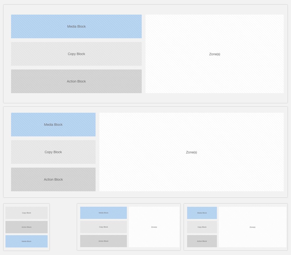
Using Brad Frost’s Atomic design principles we reduced every component to three core elements: a media block, a content block, and an action block. Starting from mobile first we developed the initial set of components that would take the place of the agency’s faulty site design.
Cedar Today
Since the initial inception of the design system, Cedar has grown to be a fully supported company initiative with a dedicated design systems team servicing the entire organization. The entirety of the system is available on Github and while I can’t and won’t take credit for its full current state, I’m very proud of the project and how it has evolved since I left in the capable hands of the team.


